
My sister just bought a new home and was agonizing about interior paint colors, as are many people. In the spring a lot of us want to freshen up the look of our homes with a new coat of paint. But how do you make a choice that you won’t be sorry about?
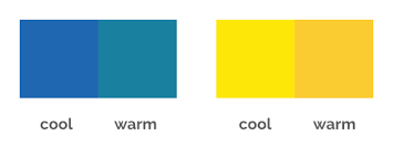
When most people think of warm and cool colors, they think of yellows and reds as warm and blues and greens as cool. The fact is there are warm and cool tones to every color. Warm tones will make a room look smaller as the walls will seem closer, while cool colors recede, making a small room look much larger. Warm colors tend to look as if the sun is shining on them, and cool colors give a feeling of the night, shadow or distance. Let’s take yellow and blue as two examples.
You probably don’t want mustard yellow on your walls, but for comparison I am using a couple of extremes. If you placed a square of mustard yellow and another one of lemon yellow side by side on the wall, the mustard (warm) would look like it was much closer to you than the lemon (cool) yellow one. The same is true about cerulean (warm) blue and ultramarine (cool) blue. It is the cool and warm tones that give a painting depth and three-dimensionality. It is also what will make your room feel larger or smaller.
First you want to choose a color that you actually like and will compliment your furnishings. I would recommend putting the paint samples next to your artwork to make sure the mattes and images work well with the wall color. Neutrals (all shades of white, cream, tan and greens) are easy to live with and decorate around. Once you decide on a color, ask the paint store expert to find a cool tone of that color to make your room seem larger. or a warm tone if you want a cozy look. Always hold the warm and cool samples side by side and you will easily be able to see which one looks like it is closer and which one seems farther away.
#spring #home #house #realtor #realestate #homeowner #paint
KathrynSmith.com